Client: The Independent Media Center
The independent media is a grassroots organization committed to using media production and distribution as tools for promoting social and economic justice in the Champaign County area. They produce an independent newspaper called the Public i. They also broadcast on a local station, WRFU 104.5 FM and allow members access to hosting their own radio show. Within their complex, they also have a stage where many concerts, artistic installments, and dances are held. They have production studios, art studios, a library, and meeting spaces. Within the IMC you will also find sub-organizations such as Books for Prisoners. The IMC is dedicated to addressing issues that the mainstream media does not.
Thursday, September 30, 2010
All natural
I love how the text visually mixes in with the swirly lines of the woman's hair in this design. I believe that the swirls are acting as serifs and that the typeface would therefore be characterized as serif. The design was used for a campaign promoting natural hair styling among African-American women, so the type serves a purpose in advertising. The design is fun, trendy, and fresh. The type really does mimic the natural qualities of hair, which makes it all the more effective!
Wednesday, September 22, 2010
Favorite logo
This week, I scanned a hat which I bought some years ago, almost completely because of the logo. I hadn't ever heard of this brand or seen this logo when I saw this hat and I immediately fell in love with it. After looking around the store, I learned that the "F" stands for famous. With this information, the logo appeared even more compelling, as it was skillfully designed to include a star, something associated with the famous by synonym and imagery. Even though the F is embroidered on the hat, it really jumps out at you in an unexpected way. This logo is very recognizable and therefore serves a function in advertising. I believe that is a decorative font that was designed specifically for this brand's logo.
Tuesday, September 14, 2010
AdLeIaVdE
I came across this tricky image on an internet forum - you can see though, that it originated from internetbumperstickers.com. I don't know who Schrödinger's cat is but I'm certainly questioning whether he's dead or alive. This image is quite captivating to me and while it looks simply made, I'm sure its creation involved fine craftsmanship. Who knew that the words dead and alive could have such an intimate relationship...
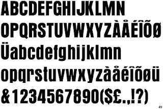
As usual, I used one of the handy font identifier websites to try and identify the typeface and found that it is likely Aura. Aura is a sans-serif, modern typeface, similar to Abadi Condensed Extra Bold that in this case, is being used in a way that is playful and interactive. I included a sample of Aura below. I think the purpose of this design is to get a reaction. No matter what the intended message within the text, an English-reading viewer is going to be perplexed by the dead/alive part. The choice of using black and white was perfect for this design, as it allows viewers to easily recognize the contrasting statements. Some of the letters are not fully represented, but each is still easily recognizable.
 |
| Aura |
Monday, September 6, 2010
Contemplation & Meditation
 |
| Beyond Earthly Sensations of Lifestyle Envy: Omnipotent Brand Mandala |
 |
| Moving From the Physical to Spiritual: Transcendental Brand Awareness Mandala 2003 |
 |
| Mobil Logo |
 |
| Standard CT Bold |
Upon realizing that this image was made mostly of type logos, I was fascinated by it. It is made to look like a mandala. Some years back a group of Tibetan Monks came to the Krannert Art Museum and made a sand mandala live for people to view. It took them something like a month to complete, I believe. Anyway, the intricacy and concentration demonstrated was unforgettable. After they completed the mandala, the finished product was displayed for a very short time before they dismantled it and poured all the sand away. I think that their perspective on life and art in particular is so interesting and inspiring. If you like this concept, you should go play around on Buddha Board's website. I'm curious whether the artist was implying something deeper about American culture within this piece.
Thursday, September 2, 2010
Kabel Book
Founded in 1927 by Rudolf Koch, Kabel was and continues to be a popular typeface with international recognition. Rudolf Koch was born in 1876 in Germany, where he worked as a type designer, typographer, calligrapher, and teacher until his death in 1934. The name, "Kabel" celebrates the first trans-Atlantic telephone cable. Its construction was influenced by ancient roman letters and geometric shapes, but brings a unique human quality, which attracts viewers. Kabel, is most recognized by its angular stroke endings, which are prominent in letters "e" and "g." Linotype categorizes Kabel as a circle, sans serif typeface, which they claim are best used to "represent sleek movement, dynamism, or the future."
Subscribe to:
Comments (Atom)


